Sara Wise, visual journalist
I make graphics for journalism.
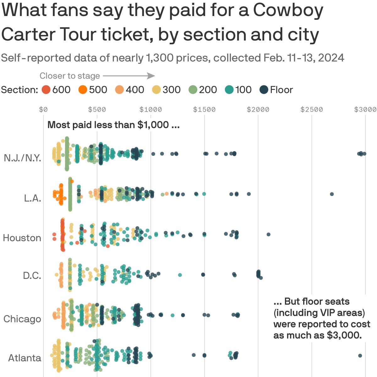
I pitched and published a visual story showing the distribution of ticket prices reported by redditors in r/Beyoncé ahead of the Cowboy Carter Tour
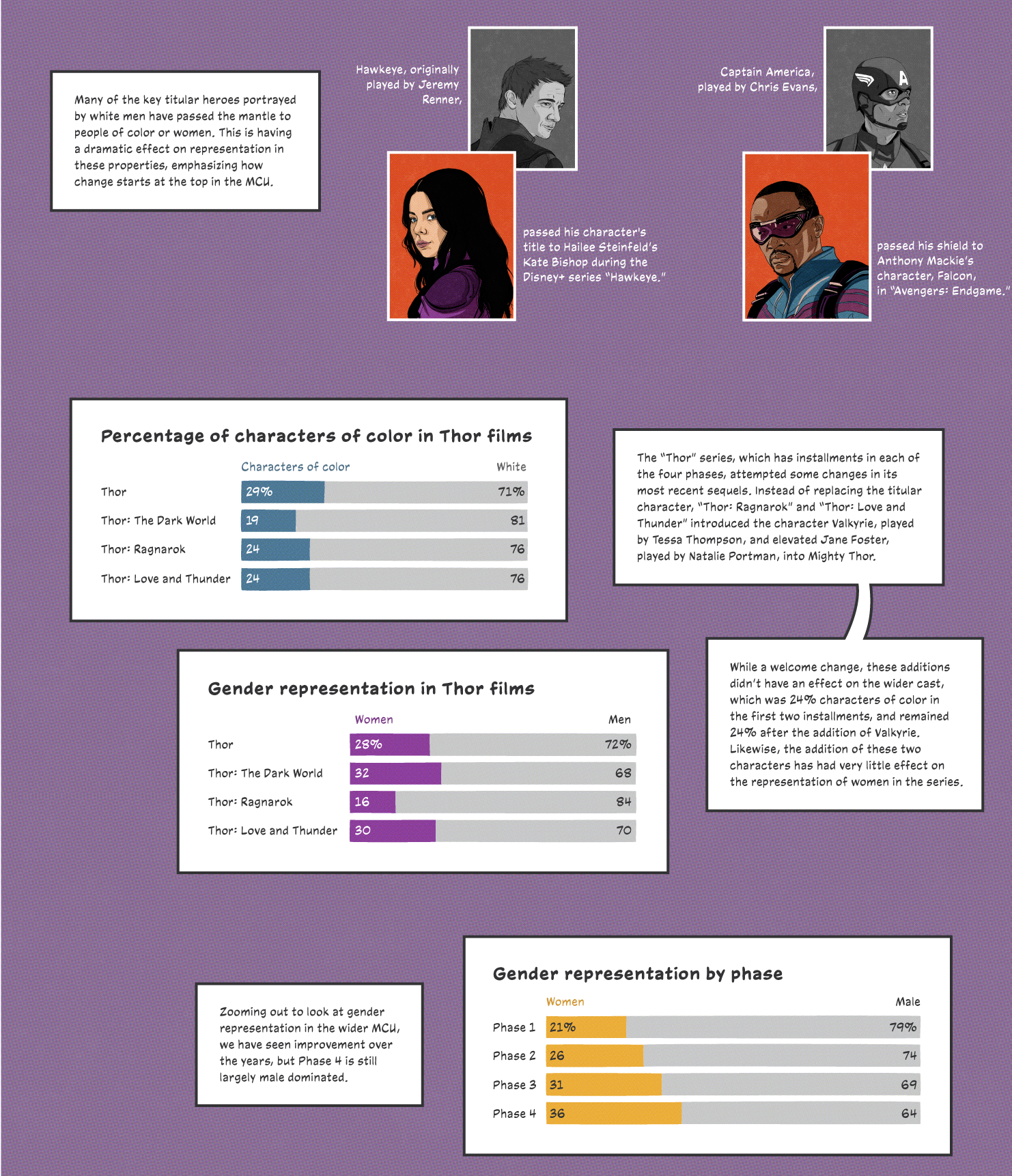
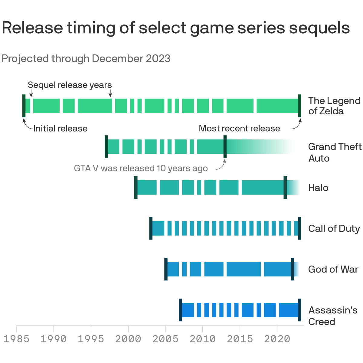
I collaborated with a Visuals colleague and Gaming reporter Stephen Totilo to show visually that video game sequels are taking longer to release.
In collaboration with a colleague, I used R to cull data from the FEC API. Then, we wrote about our findings and I visualized the data in maps and bar charts.
A Visuals colleague and I were among the first reporters to use this data source to create an interactive map charting travel distance to abortion care, which became a go-to resource for many other outlets.
Static graphics showing which Senate offices pay interns, created using Tableau and Adobe Illustrator.
For Halloween 2023, I designed and ran a bracket for readers to vote on their favorite cryptids, depicted in hand-drawn illustrations from our Visuals team.
Responsive bar charts show judicial nominees who were eventually confirmed made sizable donations to the Senate Judiciary Committee and its members.